Introduction: I read books, and as a consequence I look at a lot of them. I look at more books than I read, in fact! Sometimes looking at books makes me want to say things about what I see. So there will be an ongoing series on this blog to talk about book cover design. And the name of this series is Coverings. Don't laugh. That took me like ten minutes to think up. You don't want to hear about the options I discarded. This afternoon I stopped at the library to pick up my egregiously large pile of books on hold. In the two minutes I spent there, somehow I found both the best and the worst covers I have seen in some time.
Both made me laugh right out loud.
Man, it's been years since I've been actually shushed in a library. That takes me right back.
The first, worst cover: Eternal Kiss of Darkness by Jeaniene Frost.
Hey there, Creepy Stare-y Dude, either you've got yourself an old-fashioned nosebleed or you should really wipe the ketchup stains away before you try to seduce the girlfriend.
Add in the inexplicably cliché blue-skinned people (what is this, nighttime in a silent movie? Avatar? when did "blue skin" become code for "scary preternaturals"?) and the magenta text (eye-popping in a bad way) and you have yourself a mediocre cover-turned catastrophe.
I've saved the best for last: The Fuck-Up by Arthur Nersesian: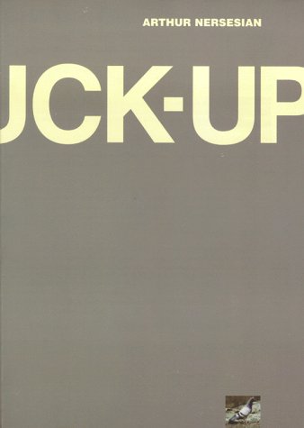
This cover, of course, is so deliberately bad that it turns brilliant. Especially since the obvious mistake in centering that bold sans-serif title underscores the title's meaning. What's more, the invisible F has the added benefit of softening what might otherwise be a more provocative and troubling cover. As is, it looks funny, and then sad. Even before I've read one word of the novel, the cover has told me a story made of only half a word and a great deal of wit.
Plus: gray. There are very few gray book covers out there. Especially a dull, slate gray like this. It's unique and impossibly boring at the same time -- a perfect combination. I am so excited to read this book that I can hardly stand it -- which is precisely as the cover designer hoped.