I never thought of myself as an artist.
I picked up beading in seventh grade. That year for Christmas I made necklaces as gifts for all my friends. I taught myself new techniques, spent hours picking colors and shapes, and even beaded one long strand that said BEST FRIENDS FOREVER in Morse Code because I am a huge nerd.
I never thought of myself as an artist.
I started beading again in graduate school, lured in by Margie Deeb's book The Beader's Color Palette, which I discovered in the tiny local bookstore near my apartment. She stunned me with the idea of pulling palettes from real life to use in jewelry, the fun of balancing multiple colors, and the power of a monochrome design. I taught myself new techniques, spent a chunk of my Jeopardy! winnings on Swarovski crystal for a necklace I never finished, and began playing with the original designs that appeared like magic in the darkness behind my eyes.
I never thought of myself as an artist. 
Soon I got my degree, got married, and got published as a romance author. It took a little practice to think of myself as a writer, but after four years I'm starting to get the hang of it. It's a label I feel a kinship with. Writers revise; writers overanalyze; writers tweak the little details and write outlines and care about the sound and the nuance of every last little word.
Writers get blocked.
The idea of failure is baked in to the concept of writer. I get frustrated at being stuck on a manuscript, of course, but I also know that it's normal, that it will pass, that it happens to virtually everyone.
But artists? Artists are magical self-expression pixies whose every gesture brings forth rainbows. Artists love Burning Man and shock value and never self-censor. Artists suffer and self-flagellate and are driven by intense and passionate ecstasies that make them one with the larger universe, especially when pharmaceutical assistance is applied. Because I wasn't drawn to the stereotypical artist lifestyle, I thought I could never lay claim to the artist label.
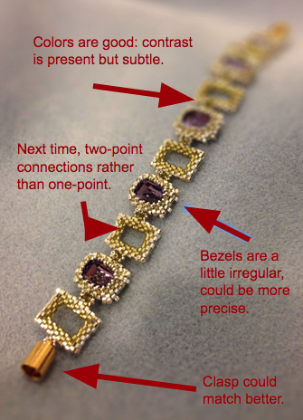
This idea of what it means to be a Capital-A-Artist is a reduction -- which is to say it's a lie. Of course artists struggle to create: creation is fiendishly hard, no matter the medium. But the stereotype persists. And that's not even taking into account the cultural division between art and craft, and the sexism that frequently lurks behind those categories. Art is expensive, public, high-status, and masculine; crafts are budget-friendly, domestic, low-status, and feminine. These distinctions are, frankly, bullshit -- but they are insidious and we yield to them without realizing we've done so. It is a bold move for a woman to declare herself an artist, and I still hesitate. I don't have an aesthetic theory to develop or a concept to illustrate or even any training whatsoever -- I've taught myself through books and magazines and the rich chaos of the internet. If I had a motto as a jewelry creator, it was this: I bet this could be better somehow.
There is a murky and mysterious abyss between beading-as-hobby and beading-as-vocation. At this point I can follow just about any pattern you show me, but that skill is no longer interesting enough on its own. Sadly, a large majority of the original designs I try are impossible in some way -- or the colors somehow go wonky -- or they just look vaguely half-assed in a way that's hard for an untrained eye to pinpoint. Luckily, Margie Deeb's latest book The Beader's Guide to Jewelry Design has just come out, and again it has kicked me in the pants in the best way. It brought to bear concepts of balance and movement as well as color, and for the past three weeks it's rarely left my side. I've also been taking some classes at my local Fusion Beads store, which has been wonderful and which has also helped me face the fact that I am definitely have more passion for beading than is contained in the word 'hobby.' But I still shy away from calling it art and I'm not looking to register at Cornish or set up an Etsy store anytime soon. I just want to learn to bead better. And maybe create some unique designs to submit to magazines/put up as an ebooklet. And maybe teach some classes sometime.
But, you know, not like an artist or anything.
You see what I mean about stereotypes being insidious?
Eventually I hit upon a way out of this mental molasses: I needed to give myself permission to revise while beading, the same way I revise while writing. To try a design a second time with new colors or different bead shapes. To let go of ideas that clearly weren't working, or to follow them through if I thought I might learn something from them.
If I couldn't think of myself as a bead artist, I could try to think of myself as a bead editor. Hence the blue pencil -- traditionally used for making corrections on manuscripts. And if I'm going to be an editor, I may as well also be a critic: I've got the vocabulary, the pretension, and the tendency to overthink. And as the saying goes: when push comes to shove, you've got to do what you love -- even if it's not a good idea.
So that's the idea behind Blue Pencil Beading: explorations of my failures and my successes, design analysis of pieces by myself and others, book reviews, aesthetic meditations, and the occasional original pattern. Posts will hopefully appear weekly. This site is a way of exploring the abyss and improving my own beadwork, but I hope it may also speak to the many others out there who are dealing with similar things.
May we all make things better, one bead at a time.

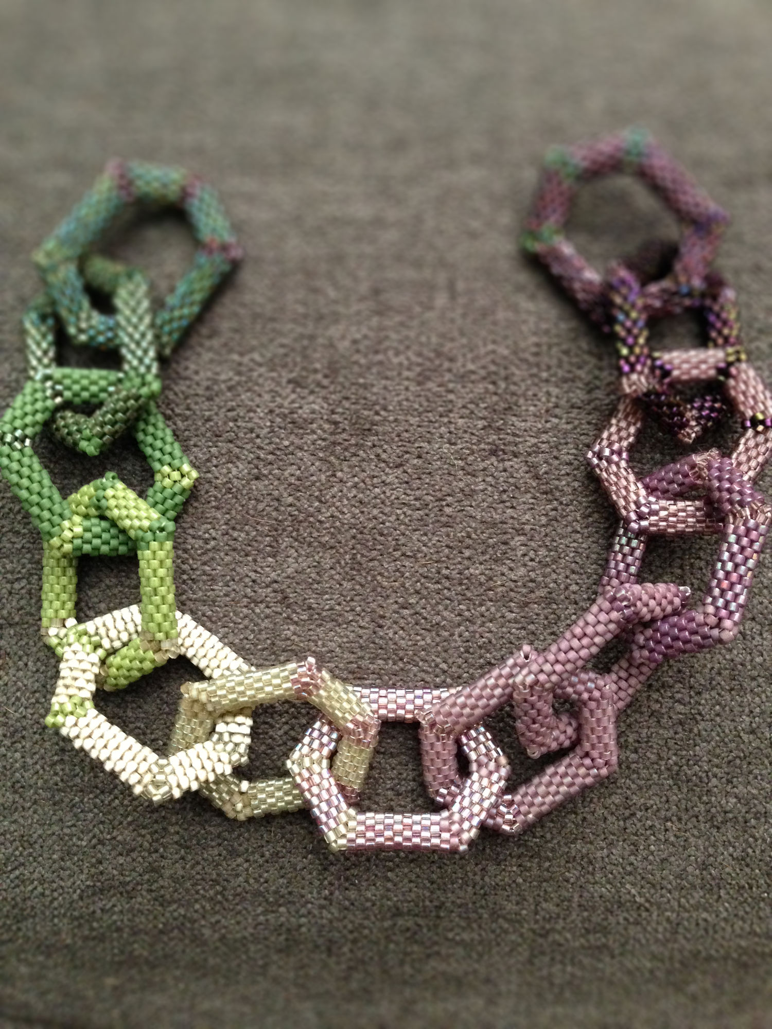
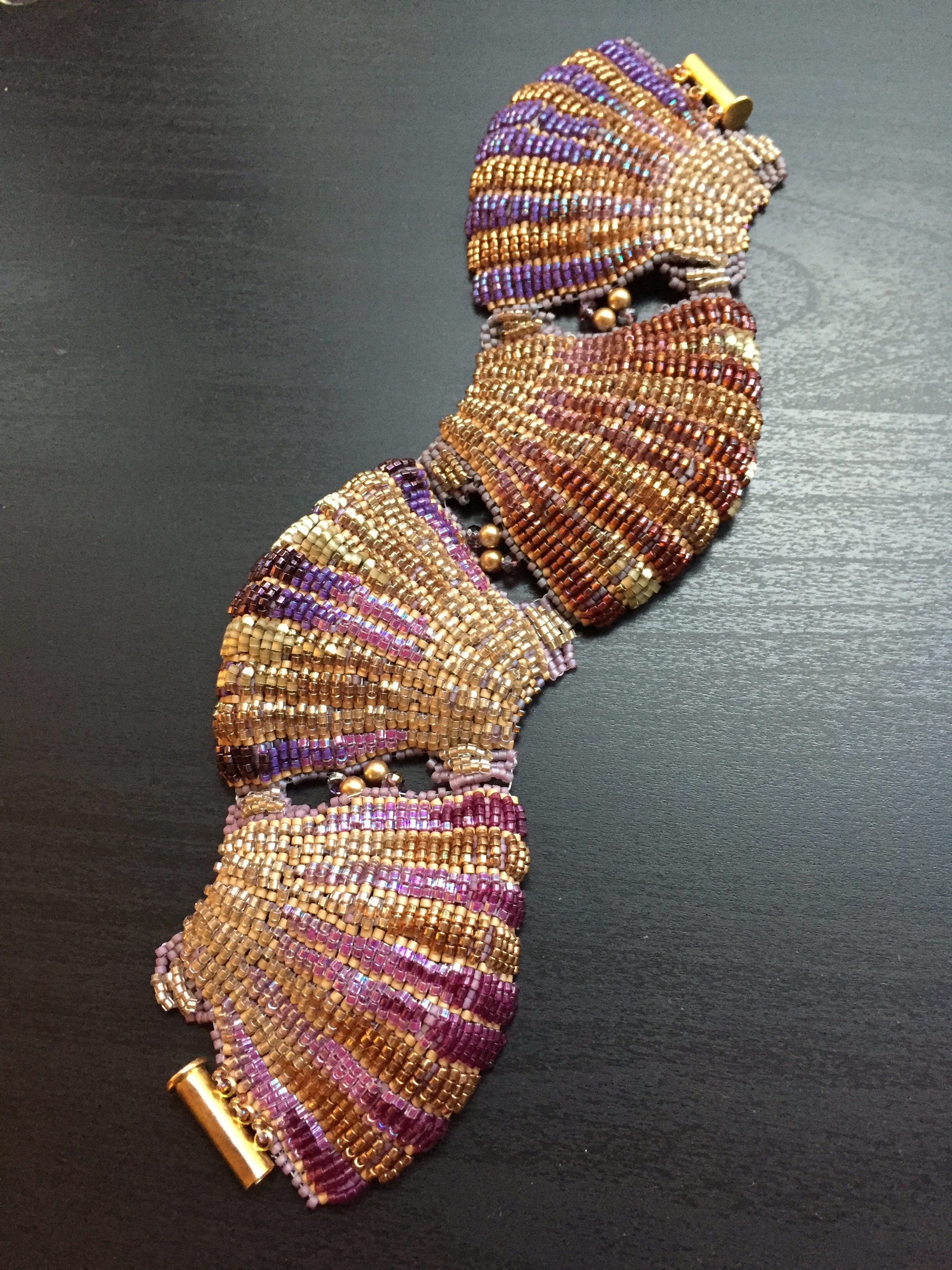 This bracelet was my entry in this year's Fire Mountain Gems and Beads contest, and can you believe it? I was a finalist! It's my third contest and my very first time finalling, so I am naturally a-burst with pride and ambition. The shells are pretty addictive to make, too, so you'll probably be seeing those in future.

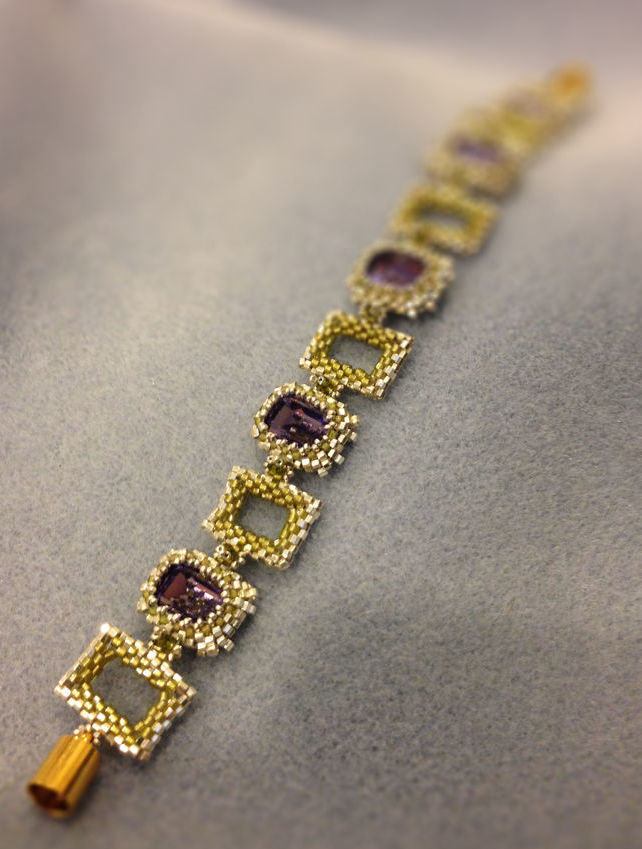


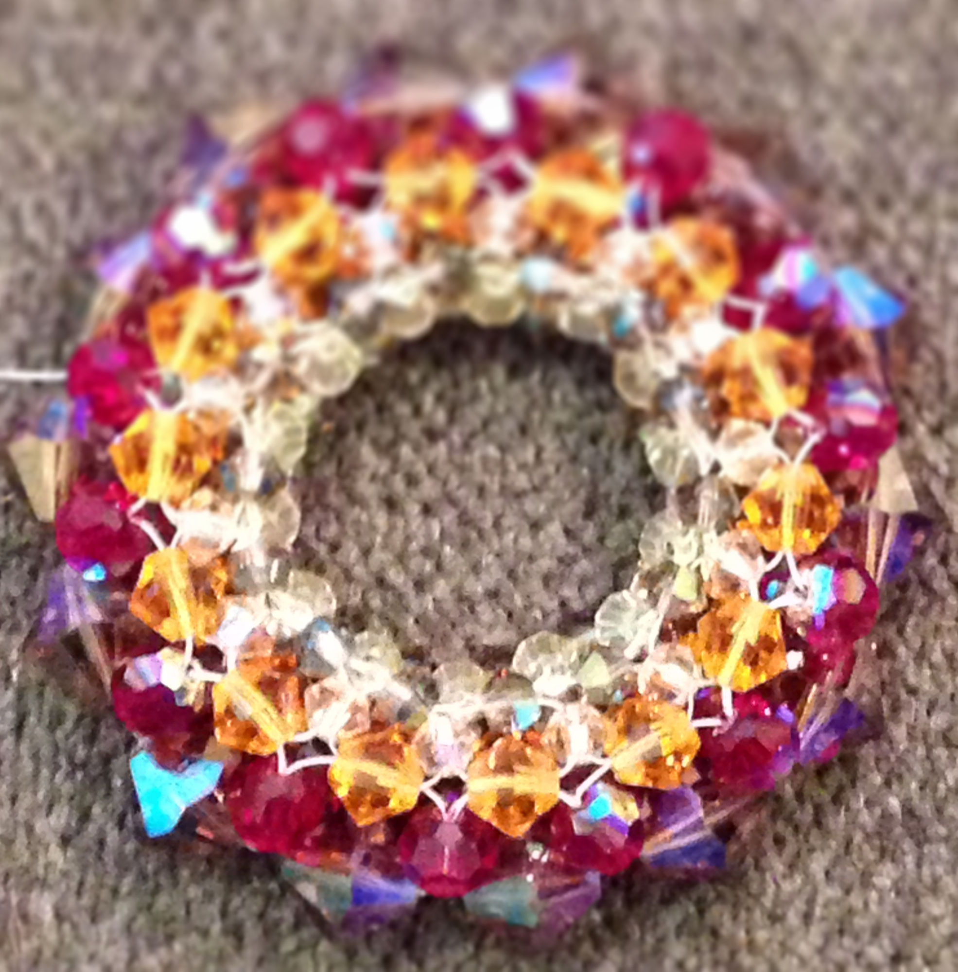 The initial right-angle ring, pictured at right, positively glowed! And the silvery beads, when placed in the netting, masked just enough of the crystal to add mystery and restraint to that riot of color. I couldn't believe I'd made such a pretty, eye-catching thing. It felt like I'd lucked into it.