Everyone knows about writer's block. It's an evil little bastard and no mistake. Every writer falls prey to it at some point in their life, myself included.
What it's taken me shamefully long to realize is that it has a damnable little cousin: beader's block.
And for the past two weeks, I've been pickling in it.
Symptoms: beader's block is most easily recognized by a sudden and universal dissatisfaction with the efforts of one's creative labor. Designs that fall apart between theory and execution; color schemes that shine in the tube but fall flat on the Fireline; time-intensive projects that grow stale with repetition; finished pieces that feel like amateur work by someone who shows no talent, imagination, or passion for the craft. Side effects may include but are not limited to: despondency, self-flagellation, and impractical purchases of new beads in frantic hope that new shiny things will dispel the clouds that are blinding you.
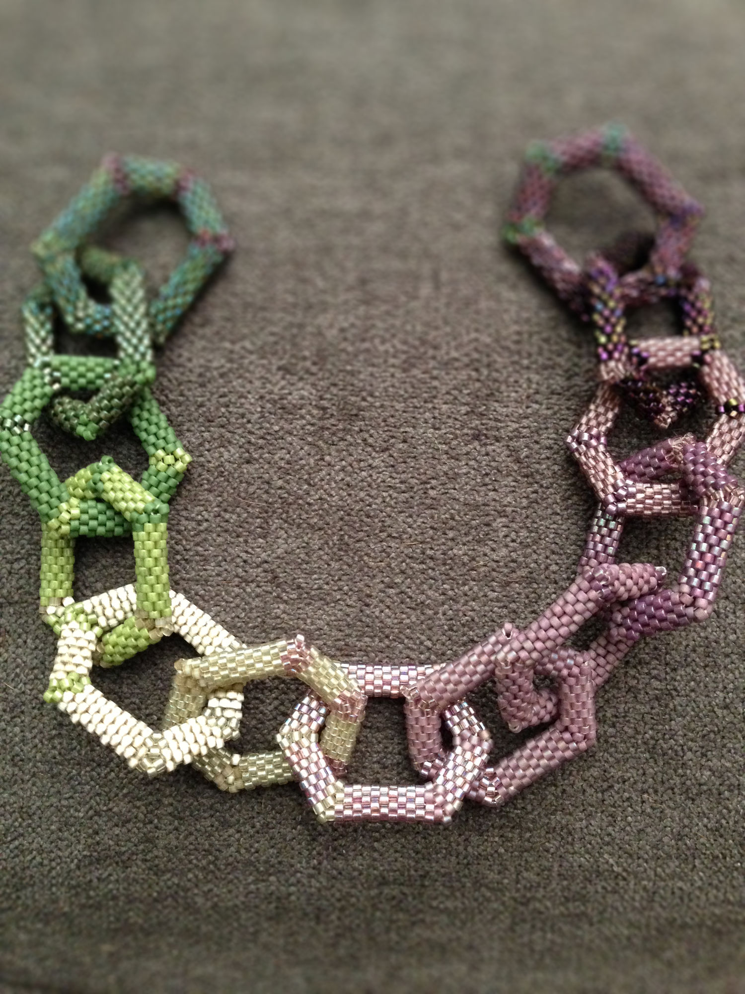
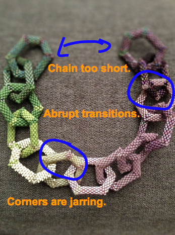
In the past fortnight I have started and then set aside/taken apart the following pieces:
- two-drop peyote bracelet with size 8 silver hex Delicas: has potential but is super-irritating to work on, for some reason
- gold hex bezels for a pair of long rectangular teal Swarovski stones
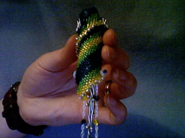
- dragonfly-inspired bracelet (peyote and brick): colors were phenomenal together but execution was lacking
- perennial "no but really this should work this time" seed bead swirl project inspired by an ancient metal torque
- dragonfly-inspired bracelet (netting)
- dragonfly-inspired bracelet (Russian spiral)
- attempt to replicate something like Miguel Ases' brick-stitched astonishments
Everything's felt like a complete and utter mess.
But if writing has taught me anything, it is this: the only way out is through.
Planning hadn't worked. Trying to fit an idea to the inspiration had failed me. So I threw myself in the opposite direction as hard as I could. I set out deliberately to make a mess. No real design, no planning, just grabbing things and putting them together.
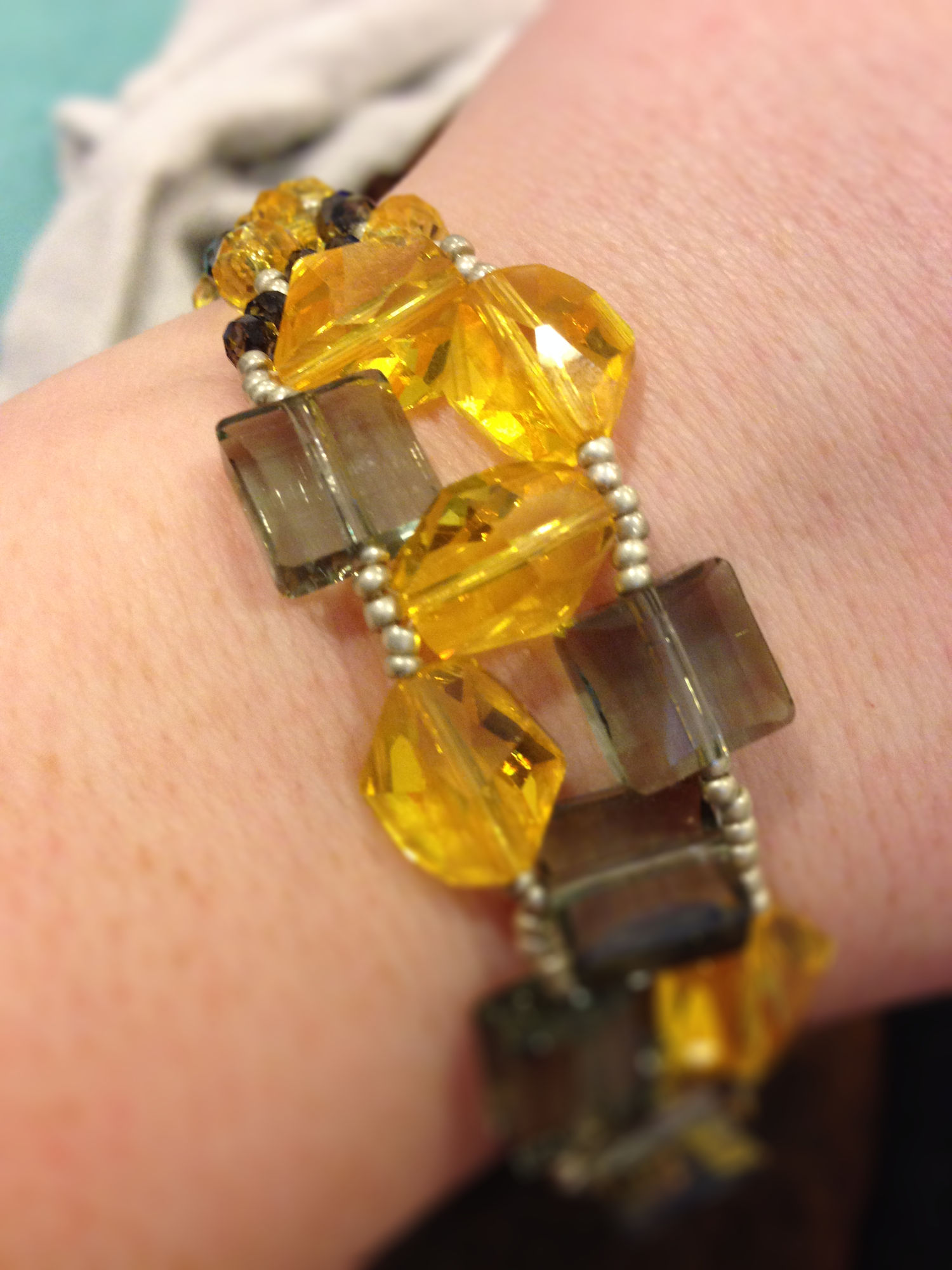
I arranged to have a crafternoon with a friend (check out her amazing plush-making Tumblr Unicorn Conglomerate), got together all my beads, every box of Delicas and seed beads and shapes and my giant shoebox of crystal. And then I essentially dicked around for two hours, stewing in my own sense of failure. It wasn't pretty, believe me. But eventually a stray thought came sneaking in, like a dribble of ink in the water: last week's Project Runway wedding dress challenge had featured one dress in a sunshine yellow. The final product had been roundly hated by the judges and got one of the designers sent home. I remembered thinking at the time that if they'd paired the yellow with a neutral -- say, gray -- the effect might have been more sophisticated. Yellow-and-gray as a color combination has been the one thing I've enjoyed seeing in fashion's current and hopefully now over obsession with neon pastels. But I haven't bought anything in that combo myself -- so why not, I thought, make myself something in that palette?
And look, here I have a handful of Swarovski crystal polygons in sunflower and light gray square stones (both now apparently discontinued, so I probably got these on clearance). I like the contrast between bright-and-rough and neutral-and-sleek. I find seed beads in a matte silver to match. And then I begin bezeling one of the sunflower stones.
It's wrong. Again.
But it's a better kind of wrong. I notice that what I like about the stones -- their edginess and the way that interacts with the blandness of the gray squares -- will be lost if I hide them in bezels. I decide right-angle-weave might be a better way to go, and I dump the beads in a pile. Then I start lining them up, piling them back, and lining them up again. I poke at them for a bit, enjoying the clink and the weight of them, and reluctant to spoil this by actually stringing them on something. At some point I realize I have accidentally created a semi-symmetrical pattern, and also that I have some smaller crystal rondelles in similar shades that I could use to create a band.
The right-angle-weave takes some arranging to get the proportions right, and then I go back through and fill in the gaps between units and to add more Fireline support to the crystral structure. (Fireline, I love you, please tell me these colored versions of you are as good as I hope.) All the while I'm planning on doing netted embellishment along the lines of my Cathedral Pendant -- but then I tie off my thread and I look at the mess I've made and it's too glorious and simple and if I add one more bead I may ruin it.
So I do something I almost never do: I stop. And here is the result.

I call it the Citrus Mess. Pictures don't quite do justice to the way the bracelet catches the light and seems to change shape from different angles -- it definitely lives in movement and has quite a lot of shine. And weight. An intensely pleasurable piece to wear. And immediately after finishing it I had another idea for a way to make cephalopod suckers out of seed beads and I tried it and it worked and that is definitely going to come up in future posts.
Roads Not Taken:
- I definitely want to experiment more with large chunky crystals and freeform right-angle-weave. It's a very forgiving way to play with color variations in a quick and satisfying way.
- Had I more of the large crystals, I would play with proportions more in individual units. Mix up larger and smaller beads, for instance, and see just how abstract I could get with it.
- Smaller crystals could easily have been set diagonal-wise into the empty spaces in the center of each RAW unit. I opted not to this time in the interest of simplicity, but if I were using more regular-shaped beads and/or had not wound the central units so tightly, it would be an excellent way to add more texture to the center of the piece.
- This would make an amazing three-strand necklace base as well.

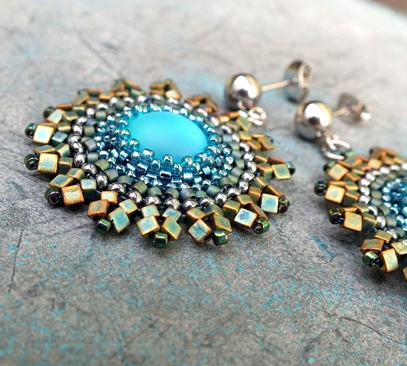
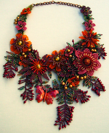
 (This image came across my Pinterest feed as 'Diamond Stars and Fringe Necklace,' but sad to say the only one I can find on the website looks a little different.)