Being good at obeying the rules means it's easy for me to follow patterns online and from beading books, which has been a great boon as a mostly self-taught creator. I was never the kid who colored outside the lines: I was the kid who learned about shading and point pressure and cross-hatching, who was careful to keep each area of color separate from its neighbor. I liked the freedom to choose colors within the limits of that black-line shape. I liked having a structure to react against -- it was safer. Being limitless felt eerily like being out in space, adrift without a ship to anchor me. I liked the secure feeling of gravity tugging at me, even as I dreamt of flying.
But rules, even laws, even the law of gravity -- sometimes they're made to be broken.
The repetitive rhythm and geometric architecture of beadweaving bears the risk of confining me to symmetry and rigidity. Old habits make me flounder a bit when asked to strike out on my own into the blue. It's profoundly helpful to see work like David Chatt's October Bracelet, which takes the regularity of cubic right-angle weave and explodes it into a symphony of chaos and visual surprise.

On the one hand: squares, right? Symmetrical squares, each side identical to every other, the most static shape in all the visual world. And cubic right-angle weave is a set of squares made of smaller squares -- it treats the beads as building blocks, and makes cube shapes out of round beads.
David Chatt has taken the most predictable shape in beadweaving and exploded it.
We have precisely one unity here: there's the individual cubic RAW unit, which has an echo in the large rectangular outline of the bracelet as a whole. That's it. Everything between those -- color, balance, texture, rhythm -- appears improvised and haphazard. Oranges, purples, and a little bit of gold-green dance around one another, sans focal. Spiral shapes and waffled areas and little zigzagging hops of cubes resting on top. Some shapes are layered on top of one another, others intertwine, others nestle against one another like lovers. I could stare at this piece for weeks and not see every detail. It really is an astonishing piece of art, and a spur to get myself out of whatever rut I find myself in, design-wise.
Try this on:
- Diane Fitzgerald's geometric shapes: cylinder beads are basically pixels, and there's a lot of color possibilities within the framework of a rigid structure.
- Bead netting: netting is such a simple stitch, but simplicity here is the foundation for ambition.
- Pearls in a rainbow of sizes and colors: right-angle weave or sculptural peyote could make a frothy, feminine masterpiece.


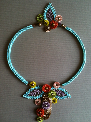
 (This image came across my Pinterest feed as 'Diamond Stars and Fringe Necklace,' but sad to say the only one I can find on the