Wednesday Workshop: Repeating Shapes, Varying Colors

Today's Wednesday Workshop features a pair of Emma Stine earrings found via Pinterest. This piece shows us a useful lesson about balancing repetition and variation in design. Emma Stine earrings.

Note how the earrings are made of identical shapes in three different colors: deep rose, pale rose, and white. The designer has put the highest contrast in the center by putting the bright white-and-metal marquise on top of the deep rose crystal marquise, making the center of the earring the focal point -- a strong design choice. The pale rose marquise frames the contrast and completes the color and shape story (we love the Rule of Three even in visual design). The round post mounts at the top echo the pattern (three colors, brightest in the middle with a pale rose frame) but don't compete with the power of the marquise shape.

Try this on:

  • Peyote hexagons and round rings, much as I love building them, aren't going to work as well for this shape story: they leave too much space on either side, which will unbalance the design. Rectangles and ovals, though, could be used in similar ways. For instance, a quick pendant design sketch: Rectangle design idea: three rectangles in various shades of blue, overlaid on one another.
  • Another idea would be to vary the order of the shapes -- put the bright white marquise in the center as a focal, flanked by several marquises of deep rose, and then straps of pale rose marquises to either side for a necklace or bracelet.

The Queen of the Night

The movie Amadeus has a lot to say about what it means to be an artist. We are shown two men who work in the same medium -- music -- but whose approaches to their art are dramatically and tragically opposed. Our narrator Salieri is religious, rigid, a trained expert with an almost mathematical approach to composition. Unfortunately for Salieri, he lives in a time and a city contemporary with the legendary Amadeus Mozart, a man of such natural genius that he waves a hand and perfect constellations of notes appear on the page. As depicted in the film, Mozart is childish, lecherous, rebellious, heedless, and completely, ridiculously talented. Salieri descends into an increasingly vicious spiral of bitterness and envy; Mozart's naïveté and blind enthusiasm lead him headlong into danger and misery and one of the saddest screen deaths you'll ever see. The trick, of course, is that a great artist must be both Salieri and Mozart.

Screenshot from Amadeus showing Mozart and Salieri. A box next to Mozart reads: brilliance, boldness, openness, passion. A simliar box beside Salieri reads: discipline, training, determination, form.

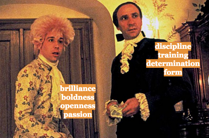
You've got to have talent—but you've also got to have the discipline to use that talent as best you can. Imagine what Salieri could have done with Mozart's gift for easy composing. Imagine what Mozart could have done with Salieri's drive and ability to focus (and climb the social ladder in the imperial court). Mozart squanders his potential literally farting around Vienna, and dies with one of his greatest works unfinished. Salieri labors too much over the form of his pieces: they sound difficult and forced and even semi-idiot emperor Franz Joseph can tell something's missing.

Mozart is able to find artistic inspiration in everything. A cruel tirade from his mother-in-law becomes one of history's most well-known coluratura pieces, commonly known as the Queen of the Night aria (though technically she has another aria in the opera as well):

It's a beautiful, impossible set of notes and it gives me chills every time I hear it. Especially because set designers usually pull out all the stops for this one, as in this design for an 1815 production of The Magic Flute:

Blue dome with stars, and tumultuous orange clouds below. A black-robed queen with crown and scepter is enthroned on a crescent moon.

Look at those colors! The celestial dome of stars above and sunset clouds of chaos beneath! The weight of that tiny black figure in the center! I could stare at this painting for hours.

Naturally, I've been dreaming of a Queen of the Night-inspired piece of jewelry for some time now. It'll probably have to be several pieces, because there are too many possibilities of color, shape, and style that I want to explore. (Same goes for Botticelli's Birth of Venus, which I've turned into a bangle, a pendant, and three necklaces so far.)

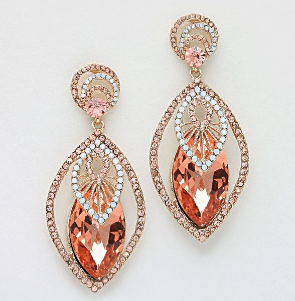
But I have to start somewhere, and I still have that stash of crystal I mentioned before, so we're going to start with something simple.

Pendant made from a series of Swarovski rivolis in dark and pale blue. Silver and blue beaded bezels mimic the progression of the phases of the moon, and bronze peyote strips connect the rivolis to one another in series.

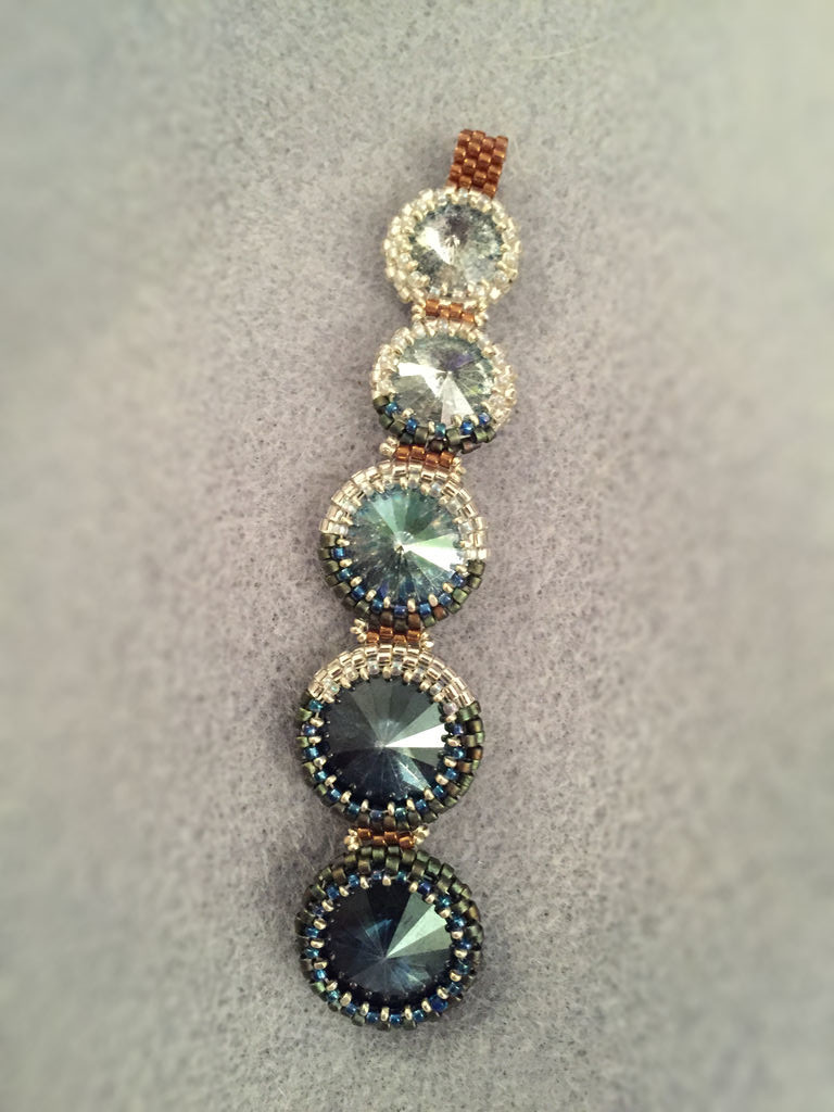
It is -- not bad! A little imprecise in its execution. I need to pay better attention to my bezel maths and try to either center things more concretely or lean into the zig-zag. But the moon-bezel idea worked out rather well, so that part of the experiment is a success!

Until next time I shall, like Salieri, endeavor to practice.

Roads Not Taken:

  • I could not think of a proper rope to match this pendant. That needs fixing in future iterations.
  • The astronomical color palette is satisfying, but I can't help wondering what the gradients would do in flashy pinks and greens and golds.
  • Turn this pendant sideways and make the center sizes larger, and you'd have a pretty stunning bracelet. That might be the thing I try next, to be honest -- a full silver/white/AB moon in the center, and smaller, darker moons fading away to either side.

Rivoli Play Time

Bezeled crystal rivolis: I love them. Love making them, love wearing them. They have the individuality and creativity of handcrafted jewelry, with the sparkle and glamor of big-budget pieces. Over the years I've bought a ton of Swarovski on clearance, found vintage treasures on Etsy, and even scored some discontinued or sample crystal stones from a friend who works for  a local retailer. I love to pull all these shinies out and run my hands through them, like a greedy pirate with a treasure chest. But I'm not as good about actually using them. I never want to turn the glittering potential into something that doesn't live up to my hopes. I'm trying to be better about this: all the bead dreams in the world won't do you any good if you never actually make anything.

So: I started with an inspiration -- there to the left.

Ancient-looking geometric multi-stone pendant on a round gold necklace base.

Nice, right? Modern but raw, asymmetric, just the right balance between minimalist and decadent. And totally recreateable with beads: an important consideration.

I realized I had amassed an accidental collection of rivolis of various shapes in shades of blue and green; I pulled out Delicas in a spectrum of gold and amber and went to work. The result? This lovely thing below, which I'm calling the Rivoli Puzzle Bracelet, because putting all the pieces together was something of a puzzle. What started as a pendant or a brooch had to become a bracelet when I realized there was no way this collection of stones could be made symmetrical.

Rivoli Puzzle Bracelet.

I have taken a couple classes from the great Laura McCabe, whose peyote bezeling technique is unparalleled. (Both books also highly recommended.) There's a bit of improvisation at play here -- navettes are still a bit of a bastard to put bezels around -- but on the whole I think it's one of the most successful pieces I've ever made. I plan on wearing it to every holiday party I'm invited to this year.

The big question as I finished the final bezel was this: how to embellish the peyote base? Ultimately, as with the Citrus Mess bracelet, I decided against embellishment, counting on the shape and color variations to give the piece movement and interest. Any embellishment I thought of sounded fussy and overdone, and would ruin the quiet strength of the developing piece.

Roads Not Taken:

  • One thing I learned is that putting a bright solid-color bezel around a lighter unfoiled rivoli means you get reflections, like pebbles on the bottom of a pond. Definitely something I want to try again in a more deliberate way.
  • I would love to get stones and Delicas in two contrasting colors and play around with intensity, such as the coral and green colors in this pin.
  • Alternatively, I would like to get a set of identical stones and then add embellishment details, such as in this lovely Lalique bracelet.


Wednesday Workshop: Pitting Color Against Shape

Nothing says "I'm a busy and responsible adult" like posting a Wednesday Workshop on a Thursday, right? Right. Today's inspiration comes from a Chanel necklace originally found on Russian Vogue, though the link appears to have gone bad. Instead, a screencap:

Chanel necklace with rounds and squares.

It is so easy, especially in beadwork where we're building components one tiny piece at a time, to believe that the colors we use have to correspond perfectly with the shapes we're building. This necklace blows that notion all to bits. The round components add one layer of symmetry, while the dark rectangles worked into the stones add a second, differently symmetrical layer. Tracing the various symmetries and asymmetries in this necklace is a full-time job.

The result is a great deal of movement for the eye, and a much more sophisticated and modern effect than a simple necklace of circular components. After staring at it for hours, slightly hypnotized, I also noticed that the round components are themselves irregular in size. This necklace is like a still of a party from a black-and-white film: a chaotic scene that happens to have been momentarily focused in time.

Try this on:

  • Any necklace made of repeated shapes, like Maggie Meister's 'Olivia' necklace (a perennial personal favorite).
  • Beaded rings of various sizes, carefully arranged -- would take some serious math-working, but would be stunning in effect.
  • Bead embroidery: the necklace base takes one shape, and the pattern on top takes another, contrasting shape.
  • Anything from Diane Fitzgerald's Shaped Beadwork could be given the same extra layer of contrast color very easily. I am tickled by the idea of a series of flat peyote hexagons in dark amber, with a bright gold or deep red line of beads wending haphazardly along the row.

Wednesday Workshop: Clasp as Balancing Element

This week's Wednesday Workshop comes from Katerina Konstantinou, beadfatuation on Pinterest. Blue herringbone necklace with pendant made of brick-stitched flowers and Russian leaf elements.

It's so easy to think of clasps as purely functional elements, necessary but not exciting. This necklace reminds me that clasps are just as much a design opportunity as pendants are: by adding floral elements to the clasp, this designer has balanced the weight of the pendant at the bottom, while allowing the appealing simplicity of the herringbone rope to remain intact. Without the decorative clasp, this necklace would feel bottom-heavy and mundane. An added bonus is that the wearer of this necklace will be just as adorned from the back as she is from the front.

Try this on: