Wednesday Workshops explore the designs of other jewelry artists, looking for inspiration and enlightenment about jewelry physics and design. The whole series can be found in chronological order here.
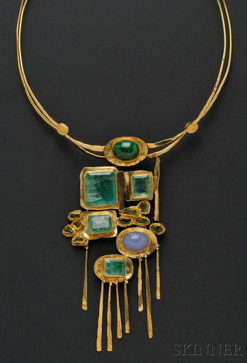
Today's workshop keeps the focus on shape and examines balance in this Fred Leighton masterpiece.
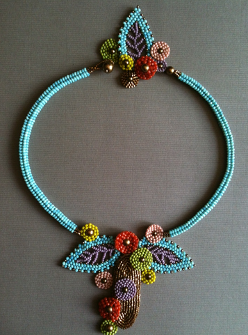
 (This image came across my Pinterest feed as 'Diamond Stars and Fringe Necklace,' but sad to say the only one I can find on the website looks a little different.)
Margie Deeb's book on bead design has a whole chapter on shape and training yourself to look closely at the shapes that make up a piece of jewelry and the shape of the piece as a whole. This Leighton necklace takes two shapes that are fundamentally opposed and makes them dance together beautifully.
Spheres are soothing shapes, regular and perfect and predictable. They speak of comfort and completion. They're weighty shapes, solid and final as the punctuation at the end of a sentence. Spikes meanwhile are dangerous, sharp, irregular, alarming. But when those solid spheres come to rest on the points of those dangerous spikes, the effect is nothing short of celestial. The spheres seem to float, small planets in a sky full of stars (even without the star shapes hanging below). Longer and shorter spikes allow the lower curve of the necklace to expand into still more negative space, keeping the overall shape fluid, dynamic rather than static. The star shapes add a bit more danger back into the mix, even as their points call back to the spikes in the rest of the necklace, leading to a feeling of completion and deliberate structure. Every part of this necklace has something to say to every other part—and at the same time, the piece as a whole has an impact completely separate from the individual components.
Try this on:
- Instead of using two contrasting shapes, use two variants of one shape. For instance: long thin isosceles triangles versus short, stubby equilateral triangles.
- Add color. But where? Should the spheres be one hue and the spikes another contrasting color? Or should the necklace as a whole show a gradient? Perhaps light on the outside and brighter on the inside?
- Double the width of the band and make this a bold cuff bracelet. Something that creeps like ice up the wrist. Something a faerie queen might wear to dazzle the hearts of her enemies.