Wednesday Workshop: Repeating Shapes, Varying Colors

Today's Wednesday Workshop features a pair of Emma Stine earrings found via Pinterest. This piece shows us a useful lesson about balancing repetition and variation in design. Emma Stine earrings.

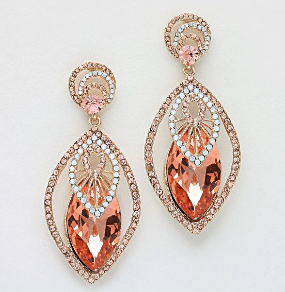
Note how the earrings are made of identical shapes in three different colors: deep rose, pale rose, and white. The designer has put the highest contrast in the center by putting the bright white-and-metal marquise on top of the deep rose crystal marquise, making the center of the earring the focal point -- a strong design choice. The pale rose marquise frames the contrast and completes the color and shape story (we love the Rule of Three even in visual design). The round post mounts at the top echo the pattern (three colors, brightest in the middle with a pale rose frame) but don't compete with the power of the marquise shape.

Try this on:

  • Peyote hexagons and round rings, much as I love building them, aren't going to work as well for this shape story: they leave too much space on either side, which will unbalance the design. Rectangles and ovals, though, could be used in similar ways. For instance, a quick pendant design sketch: Rectangle design idea: three rectangles in various shades of blue, overlaid on one another.
  • Another idea would be to vary the order of the shapes -- put the bright white marquise in the center as a focal, flanked by several marquises of deep rose, and then straps of pale rose marquises to either side for a necklace or bracelet.

Wednesday Workshop: Contrast Within a Gradient

Today's Wednesday Workshop is all about color. As I broaden my ability to work with various color palettes, I've been leaning on color gradients to help me find my bearings in this strange new world. For instance, in this peyote hex chain experiment from earlier this year. But a beader cannot bead with gradients alone. Eventually there must be innovation. Such as the gradient in this pair of earrings I found on Pinterest:

Peyote bezeled lucite cabochon with herringbone embellishment.

Lovely and luminous. The general movement of color is from ice blue in the center to bottle green on the outer edge, but it is not a straight progression: there is a row of silver after the first row of green beads. High contrast, as Margie Deeb teaches us, draws the eye, so this silver row acts as a frame for the center cabochon and gives the gradient a sense of structure.

Try this on:

  • Brick-stitched bezels around a central bead, as in this Fusion Beads tutorial, or anything inspired by the brilliant work of Miguel Ases.
  • A necklace of solid-color beaded beads in progression: switch up two beads in the center for a high-contrast focal point that does not break the palette.
  • A three-drop peyote cuff: always good for playing with color and contrast.

Wednesday Workshop: Pitting Color Against Shape

Nothing says "I'm a busy and responsible adult" like posting a Wednesday Workshop on a Thursday, right? Right. Today's inspiration comes from a Chanel necklace originally found on Russian Vogue, though the link appears to have gone bad. Instead, a screencap:

Chanel necklace with rounds and squares.

It is so easy, especially in beadwork where we're building components one tiny piece at a time, to believe that the colors we use have to correspond perfectly with the shapes we're building. This necklace blows that notion all to bits. The round components add one layer of symmetry, while the dark rectangles worked into the stones add a second, differently symmetrical layer. Tracing the various symmetries and asymmetries in this necklace is a full-time job.

The result is a great deal of movement for the eye, and a much more sophisticated and modern effect than a simple necklace of circular components. After staring at it for hours, slightly hypnotized, I also noticed that the round components are themselves irregular in size. This necklace is like a still of a party from a black-and-white film: a chaotic scene that happens to have been momentarily focused in time.

Try this on:

  • Any necklace made of repeated shapes, like Maggie Meister's 'Olivia' necklace (a perennial personal favorite).
  • Beaded rings of various sizes, carefully arranged -- would take some serious math-working, but would be stunning in effect.
  • Bead embroidery: the necklace base takes one shape, and the pattern on top takes another, contrasting shape.
  • Anything from Diane Fitzgerald's Shaped Beadwork could be given the same extra layer of contrast color very easily. I am tickled by the idea of a series of flat peyote hexagons in dark amber, with a bright gold or deep red line of beads wending haphazardly along the row.