Today's Wednesday Workshop is all about color. As I broaden my ability to work with various color palettes, I've been leaning on color gradients to help me find my bearings in this strange new world. For instance, in this peyote hex chain experiment from earlier this year. But a beader cannot bead with gradients alone. Eventually there must be innovation. Such as the gradient in this pair of earrings I found on Pinterest:
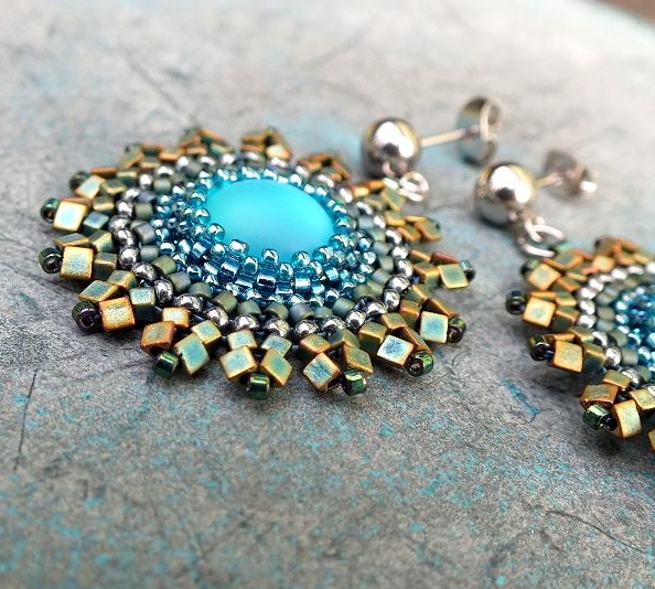
Lovely and luminous. The general movement of color is from ice blue in the center to bottle green on the outer edge, but it is not a straight progression: there is a row of silver after the first row of green beads. High contrast, as Margie Deeb teaches us, draws the eye, so this silver row acts as a frame for the center cabochon and gives the gradient a sense of structure.
Try this on:
- Brick-stitched bezels around a central bead, as in this Fusion Beads tutorial, or anything inspired by the brilliant work of Miguel Ases.
- A necklace of solid-color beaded beads in progression: switch up two beads in the center for a high-contrast focal point that does not break the palette.
- A three-drop peyote cuff: always good for playing with color and contrast.